-
 GEOLOGY & GEOPHYSICS
G&G
| SARAH LAMBART
GEOLOGY & GEOPHYSICS
G&G
| SARAH LAMBART
-
GEOLOGY & GEOPHYSICS | SARAH LAMBART
- Back to Resourcess
Some individuals have a perception of colors different from what most people see. This decreased ability is called color blindness or color vision deficiency.
When you design a slideshow/poster for a presentation, a figure in an article, a flyer ... it's important to keep that in mind and try to make your design accessible to everybody.
Roughly 8% of men and 0.5% of women are Color Blinds. It's a lot right?
You would not want your design to be un-friendly to that many people?
The main cause of color blindness is genetic and so far there is no treatment.
The human retina contains photoreceptors: the rod cells, responsible for low-light vision and 3 categories of cone cells, sensitive for the long- (red), medium- (green) and short-wavelengths (blue) of the visible light.
In case of color blindness these cones may be deficient or absent.
| Deficient | Absent | |
|---|---|---|
| L-Cone (Red) | Protanomaly | Protanopia |
| M-Cone (Green) | Deuteranomaly | Deuteranopia |
| S-Cone (Blue) | Tritanomaly | Tritanopia |
| 2 or 3 Cones | Monochromacy |
Deutan: Unable to distinguish between colors in the green-yellow-red section of the spectrum.
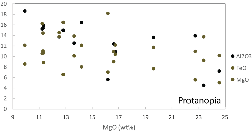
Protan: Also unable to distinguish between colors in the green-yellow-red section of the spectrum. And the brightness of red, orange, and yellow are much reduced compared to normal. Reds may be confused with black or dark gray.
Tritan: Blue-indigo-violet are seen greenish and drastically dimmed, down to black.
Monochomats: Totally unable to see colors.
By example red-green color blinds (Deutan and Protan) can't tell if a banana is ripe or see a red-berry in a tree.
Regarding design, it might be difficult for them to name a color, to associate the color in a caption to the one in the figure, to distinguish to or more colors from each other, or it might be impossible to simply read Red text over a dark background.
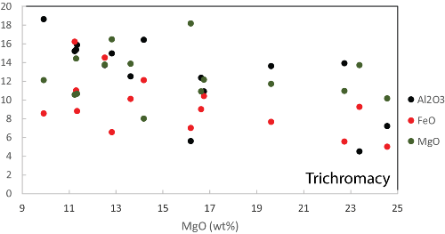
Here is a simulation of what a rainbow of color looks like for colorblinds:
Normal Vision
Deutan Vision
Protan Vision
Tritan Vision
A good design increases accessibility for colorblind. Here are some suggestions to be color-blind-friendly.
| Color | Color Name | R | G | B |
|---|---|---|---|---|
| Black | 0 | 0 | 0 | |
| Orange | 230 | 159 | 0 | |
| Sky Blue | 86 | 180 | 233 | |
| Bluish Green | 0 | 158 | 115 | |
| Yellow | 240 | 228 | 66 | |
| Blue | 0 | 114 | 178 | |
| Vermillon | 213 | 94 | 0 | |
| Reddish Purple | 204 | 121 | 167 |
EFFECTIVE
LESS EFFECTIVE
EFFECTIVE
MEH...
EFFECTIVE
LESS EFFECTIVE
EFFECTIVE
REALLY???
EFFECTIVE
LESS EFFECTIVE
NOT THE BEST
HELP ME!!!
Dr Sarah Lambart
Geology and Geophysics, Frederick Albert Sutton Building
115 S 1460 E, Room 409
Salt Lake City, UT 84112-0102